Candlestick
See live examples in scanner →A candlestick chart shows the Open, High, Low, and Close (OHLC) for each session, drawn as a body between open and close with thin wicks (shadows) marking the high and low. The body's color reveals who controlled the session, but a single candle records only what happened, not what comes next.
Before you learn to read patterns, learn to read a single candle. Everything else builds on this.
What Is a Candlestick?
A candlestick is a way to display price data for a single time period — usually one trading day. Each candle captures four pieces of information: Open, High, Low, and Close (OHLC).
The Open is where the session began. The Close is where it ended. The High is the highest price reached during the session. The Low is the lowest. Four numbers, one candle — and from those four numbers, you can read the entire story of a trading session.
If you are familiar with bar charts, the transition is direct. Both show the same high-to-low range — a single vertical line on a bar, and a body with wicks above and below on a candle. The bar's two ticks (open and close) become the top and bottom of the candle's body. Candles add one thing: color. Green when the close is above the open. Red when below. Same data, less work to read.
One convention note: green/red is the modern software default. Older books use white (up) and black (down) for the same thing, and some platforms color candles by comparison with the prior close (keeping hollow/filled for open-vs-close) — worth checking your chart settings once so the colors mean what you think they mean.
Anatomy of a Candle
Every candlestick has up to three visible parts: the body, the upper wick (also called the upper shadow), and the lower wick (lower shadow). Together, these three elements tell you everything that happened during the session.
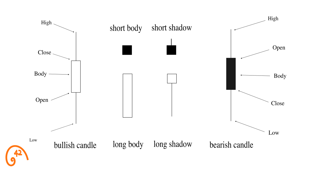
Not every candle has all three parts. Some candles have no upper wick — meaning the close (or open) was the session high. Some have no lower wick — meaning the open (or close) was the session low. Some have almost no body at all, just wicks — those are called Doji candles, and they signal indecision. The presence or absence of each part is itself information.
Reading the Body
The body is the most important part of the candle. It tells you two things at once: who won (color) and how decisively (size).
A large green body means buyers were in control from open to close. Price moved meaningfully higher, and there was little give-back along the way. The larger the body, the stronger the conviction behind the move.
A large red body tells the opposite story — sellers dominated the session. Price moved meaningfully lower and closed near the low. Again, the larger the body, the more one-sided the session was.
A small body — regardless of color — means neither side took clear control. The session opened and closed near the same price. This is indecision. It doesn't tell you which direction price will go next, but it tells you something important: the current side's grip is loosening.
"Price opened low and closed high. Buyers dominated this session."
A large green body with small wicks. The open is near the low and the close is near the high. There was no meaningful pushback from sellers. This is a session of strong bullish conviction.
"Price opened high and closed low. Sellers dominated this session."
A large red body with small wicks. The open is near the high and the close is near the low. Buyers never mounted a serious defense. This is a session of strong bearish conviction.
"Price went nowhere. Neither side could take over."
A small body — green or red doesn't matter much — with wicks on both sides. The open and close are near the same price. The market explored both directions but committed to neither. This is indecision.
A candlestick is a one-session biography of the market. The body tells you who won. The wicks tell you who tried.
Reading the Wicks
If the body tells you who won the session, the wicks tell you who tried and failed. Every wick represents a price level that was reached during the session but couldn't be held by the close. That's rejection.
A long upper wick means price rallied during the session but sellers pushed it back down before the close. Buyers tried to take control of higher prices and were rejected. The longer the upper wick, the more forceful the rejection.
A long lower wick means price dropped during the session but buyers stepped in and pushed it back up. Sellers tried to establish lower prices and were rejected. This is the foundation of patterns like the Hammer — a long lower wick after a decline shows that buyers defended a level.
Long wicks on both sides mean the session was heavily contested. Price moved significantly in both directions but ended up near where it started. Neither buyers nor sellers could maintain control. These candles often appear at turning points — or during periods of genuine uncertainty.
No wicks at all — a candle where the open or close equals the high and low — is the most extreme signal. It means one side controlled the entire session from start to finish with zero pushback. These are rare, and they carry weight.
One Candle, Any Timeframe
Everything above assumed a daily candle, but the mechanics are interval-agnostic: one candle is simply the OHLC of its time period. A weekly candle is that week's open, high, low, and close. A 5-minute candle is that five minutes'. Change the timeframe and the candles redraw — same encoding, different resolution.
So what timeframe should a beginner use? Daily. Not because intraday charts are wrong, but because daily candles carry three practical advantages while you're learning: each candle summarizes a full session, so there's less noise and fewer false signals; you can read them after the market closes, so there's no screen-watching; and the textbook patterns you'll learn next were documented on daily charts in the first place. The same shapes appear on a 5-minute chart, but they fail more often there — shorter intervals mean more randomness per candle.
This is also why our scanner works on daily candles: it reads each stock's completed session after the close, when the candle's story is finished — not while it's still being written.
What a Single Candle Can't Tell You
Before going further, it's worth being clear about the limits. A single candlestick — no matter how dramatic — can only tell you so much.
A single candle's meaning depends on the trend it appears in. A bullish-looking candle after a prolonged downtrend can signal exhaustion. The same candle in a sideways market is often just noise. Same shape, different story.
A single candle shifts probabilities — it doesn't guarantee outcomes. A strong bullish candle may increase the odds of a reversal, but it doesn't confirm one. A large bearish candle warns of weakness, not certainty. The candle raises the question. The next session, the volume, and the level it formed at begin to answer it. That's exactly why the rest of these guides exist.
A single candle doesn't tell you why. Was the move driven by earnings, macro news, or positioning? The candle shows who won the battle — not why it was fought.
This matters because beginners often overweight a single candle. They see a dramatic shape and treat it as a signal. Sometimes it is — but only in context. A candle is one sentence. You need the paragraph.
Reading Candlesticks in Context
Four lenses turn a candle into a signal: volume, structure, momentum, and the level it forms at. Each gets its own dedicated guide; this is the quick orientation.
Volume — how much conviction was behind the candle. A green candle on heavy volume means a crowd of buyers drove it. The same candle on light volume might just be noise. The metric to know: relative volume (rVol) — today's volume vs the stock's 20-day average. Read the Candlesticks + Volume guide →
Structure — the zones that give a candle's location meaning. Support, resistance, and moving averages are zones where buyers or sellers have historically shown up. A bullish candle bouncing off support is forming where buyers showed up before. A candle in open space has no anchor. Read the Candlesticks + Moving Averages guide →
Momentum — how stretched the move is. RSI runs from 0 to 100. Readings below 30 are traditionally called oversold and above 70 overbought — conventions, not guarantees, but a reversal candle appearing when a move is already stretched deserves more attention than one mid-range. Read the Candlesticks + RSI guide →
Retracement levels — how far has the pullback come? Fibonacci retracement levels mark how much of the prior move a pullback has given back; a reversal candle printing in a widely watched retracement zone has a reason to be there. Read the Candlesticks + Fibonacci guide →
Volume (Relative Volume), structure (Moving Averages, Support/Resistance), momentum (RSI), levels (Fibonacci) — these four lenses will come up in every pattern guide that follows.
Pattern tells me where to look, context tells me whether to act.
Reading Candles in Sequence: $AEP
Reading individual candles is the skill. Reading them in sequence is where that skill becomes useful. Let's look at a real chart and practice narrating what each candle is telling us — not as a trade setup, but as a story.
American Electric Power ($AEP) went through a multi-session decline in early October 2025. The chart below captures a sequence worth studying — not because there's a specific pattern to trade, but because the candles tell a clear narrative if you know how to read them.
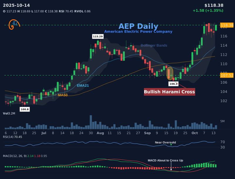
Start from the left. You'll see a series of red candles — large bodies, small wicks. That's sellers in control, session after session. No contest. Each close is lower than the one before. This is what a decline looks like at the candle level: conviction from one side and silence from the other.
Then notice the shift. A particularly large red candle appears — the body stretches wider than the ones before it. This is capitulation energy: sellers are pressing hardest right when the move is most extended. Experienced traders pay attention when they see this because extremes tend to mark turning points, not continuations.
The next candle is the one that changes the story. It's small. The body is contained entirely within the previous candle's range. After sessions of aggressive selling, the market paused. Neither side pushed hard. The narrative shifted from "sellers in control" to "sellers paused." That single shift in body size is information.
What follows is recovery — green candles with growing bodies. Buyers start to show up. The wicks shorten on the upside, meaning buyers are holding their gains into the close rather than giving them back. The story, candle by candle, went from "aggressive selling" to "exhaustion" to "tentative buying" to "buyers gaining conviction."
Notice what we didn't do. We didn't name a pattern. We didn't call a trade. We just read the candles — body size, wick length, color, and position relative to the previous candle. That's the foundational skill. Pattern names are shortcuts for sequences like this, but the reading comes first.
- A candlestick encodes four prices — Open, High, Low, Close — into a single visual shape
- The body shows who won (color) and how decisively (size)
- The wicks show who tried and failed — rejected price territory that couldn't hold
- Body size is relative: always compare to the stock's recent candles, not an abstract standard
- A single candle tells you what happened in one session — not the trend, not the future
- Context transforms a candle from a shape into a signal: volume, structure, and momentum all matter
- Reading candles in sequence — narrating the story session by session — is the skill that every pattern builds on
Where Candlesticks Come From
Candlestick charting is traditionally credited to Munehisa Homma, an 18th-century Japanese rice merchant who traded at the Dojima Rice Exchange in Osaka and wrote one of the earliest books on market psychology — the insight that prices move on traders' emotions as much as on rice itself. Honest history is a little fuzzier than the legend: the charts themselves probably took their modern form in the late 1800s, after Homma's time, built on the trading culture he helped create.
What's certain is the Western chapter: Steve Nison brought candlestick charting to Western traders — cemented by his 1991 book Japanese Candlestick Charting Techniques — and it displaced bar charts as the default almost everywhere. The pattern names you'll meet in the guides that follow — Doji, Harami, Morning Star — carry that Japanese lineage.
Frequently Asked Questions
What does OHLC stand for?
OHLC stands for Open, High, Low, Close — the four prices that define each candlestick. The Open is where the session started, the High is the highest price reached, the Low is the lowest price reached, and the Close is where the session ended. Every candlestick chart is built from these four data points.
What is the difference between a wick and a shadow?
Nothing — they're the same thing. "Wick" and "shadow" are interchangeable terms for the thin lines above and below the candle body. Some resources use "shadow" (from the Japanese origins of candlestick charting) and others use "wick" (a more intuitive English term). You'll see both in practice.
Does candle color matter?
Color tells you whether the close was above the open (green/bullish) or below the open (red/bearish). It matters as one piece of information, but it's not the whole story. A red candle with a very long lower wick can be more bullish than a small green candle. Always look at body size, wick length, and context together — not color alone.
What is the difference between a candlestick chart and a bar chart?
Both display the same OHLC data. A bar chart uses a vertical line for the range (high to low) with small horizontal ticks for the open (left) and close (right). A candlestick uses a filled or colored body between the open and close, making it immediately clear who controlled the session. The information is identical — candlesticks are just easier to read at a glance.
Can a single candlestick predict the direction of the next move?
No. A single candle tells you what happened in one session, not what will happen next. Some candle shapes — like a Hammer after a decline — shift the odds, but they don't predict outcomes on their own. Every candle needs context: What came before it? Where did it form? What was the volume? Prediction comes from context, not from any single candle.
Where should I go after learning the basics of candlesticks?
Start with single-candle patterns like the Hammer — it builds directly on the body-and-wick reading you learned here. From there, move to two-candle patterns like the Engulfing, where you'll use your ability to read candles in sequence. Each pattern is a named shortcut for a specific candle story.
What does a green or red candlestick mean?
Green means the close was above the open — buyers finished the period in control. Red means the close was below the open — sellers finished in control. That is all the color encodes: the direction of the period, not its importance. A small green candle after a huge decline can matter far more than a big red one in the middle of nowhere. Note that colors are conventions: older books use white/black, and platforms let you customize.
What timeframe should a beginner use for candlestick charts?
Daily candles are the standard starting point. Each candle summarizes one full session, so there is less noise than intraday charts, no screen-watching required, and it is the timeframe most textbook patterns were originally documented on. The mechanics are identical on any interval — a weekly candle is that week's OHLC, a 5-minute candle is that 5 minutes' — but lower timeframes produce more false signals. Our scanner works on daily candles for exactly these reasons.
Who invented candlestick charts?
Tradition credits Munehisa Homma, an 18th-century Japanese rice merchant who traded at the Dojima Rice Exchange in Osaka and wrote one of the earliest books on market psychology. Honest history is fuzzier: the charts themselves probably took their modern form in the late 1800s, after Homma's time. What is certain is that Steve Nison introduced candlestick charting to Western traders in 1991, and it has been the default chart style ever since.
The Bottom Line
Every pattern you'll learn starts with this: reading what happened in one session. The body shows conviction. The wicks show rejection. The volume shows participation. Master these three, and every pattern guide that follows will make more sense.
Candlestick patterns are just named shortcuts for stories that candles tell. The Hammer is a story about sellers failing to hold the low. The Engulfing is a story about one side completely overwhelming the other. The Doji is a story about neither side winning. Once you can read the candle, the pattern name is just a label.
Start with the body. Add the wicks. Check the volume. Read the sequence. That's the process — and it works the same way whether you're looking at a $10 stock or a $1,000 one.
Where to go from here. Single-candle patterns first: Hammer and the Doji family. Then multi-candle stories, up to the Morning Star. When you want the whole catalog at a glance, the cheat sheets compress it: formation rules, confirmation, and invalidation for every pattern on one page — plus the psychology behind each candle story. And if you're still choosing a chart style, the comparisons cover OHLC bars, line charts, and Heikin-Ashi.
Ready to see these concepts in action? Open the scanner and read a few real candles using what you just learned — body, wicks, color, sequence.
Open the scanner →In this guide
'%3e%3crect%20width='240'%20height='240'%20fill='%23FF7A00'%3e%3c/rect%3e%3cg%20transform='matrix(0.07095%200%200%20-0.07095%2015%20220.748)'%20fill='%23FFFFFF'%20stroke='none'%3e%3cpath%20d='M1365%202583%20c-628%20-81%20-1087%20-602%20-1111%20-1258%20-9%20-231%2023%20-399%20111%20-580%20207%20-427%20651%20-631%20900%20-414%20313%20274%2067%20875%20-305%20744%20-177%20-63%20-242%20-307%20-110%20-418%2098%20-83%20230%20-43%20230%2069%200%2047%20-5%2051%20-34%2029%20-55%20-42%20-117%204%20-100%2073%2020%2082%20131%20108%20196%2046%2074%20-71%20100%20-207%2058%20-316%20-65%20-174%20-281%20-266%20-437%20-185%20-146%2075%20-276%20272%20-340%20515%20-34%20128%20-39%20396%20-10%20532%20103%20479%20422%20837%20856%20958%20143%2040%20402%2039%20536%20-1%20434%20-132%20743%20-484%20841%20-959%2019%20-91%2024%20-295%2011%20-413%20-11%20-91%20-2%20-80%2029%2041%2080%20312%2017%20689%20-163%20972%20-253%20397%20-715%20623%20-1158%20565z'%3e%3c/path%3e%3cpath%20d='M2035%201809%20c-63%20-18%20-121%20-85%20-140%20-161%20-6%20-23%20-3%20-27%2027%20-33%2018%20-3%2040%20-9%2050%20-11%2011%20-3%2018%203%2023%2023%2025%20113%20189%20126%20225%2018%2031%20-93%20-7%20-155%20-243%20-409%20-86%20-92%20-88%20-96%20-85%20-138%20l3%20-43%20223%20-2%20222%20-3%200%2045%20c0%2025%20-1%2048%20-2%2053%20-3%207%20-22%208%20-191%2011%20l-98%201%2075%2083%20c167%20181%20210%20263%20204%20379%20-8%20148%20-140%20232%20-293%20187z'%3e%3c/path%3e%3cpath%20d='M1579%201733%20c-29%20-43%20-106%20-154%20-171%20-247%20-107%20-152%20-118%20-173%20-118%20-212%20l0%20-44%20173%20-2%20172%20-3%203%20-88%203%20-89%2052%204%20c32%202%2052%208%2053%2016%201%206%202%2046%203%2087%20l1%2075%2045%200%2045%200%200%2050%200%2050%20-45%200%20-45%200%20-1%20173%20c-1%2094%200%20202%201%20240%20l2%2067%20-60%200%20-60%200%20-53%20-77z%20m58%20-400%20c-3%20-2%20-52%20-2%20-110%20-1%20l-105%203%20107%20155%20106%20155%203%20-154%20c1%20-85%201%20-156%20-1%20-158z'%3e%3c/path%3e%3c/g%3e%3c/g%3e%3c/svg%3e)
42Fibonacci